CD cover research

Today we as further research and planning for our artists album and image we have produced research on what it takes to create a successful CD cover.


Firstly we researched a similar individual artists we an expressionist view like Paleme. This CD Cover by Khaled includes a similar image that we wish to portray with an outdoor theme along with individual shots of the artists. As you can see this CD cover is successful as the album name, artist, theme and songs are all clear and stand out straight away to the audience.

Digipak Research- Imagine Dragons

Imagine Dragons are an alternative rock group therefore is similar to Paleme. On the other hand, Imagine Dragons released an album on the 23rd of June 2017. From the front cover you can see it is very simplistic and apart from the middle strip down the centre there is minimal use of colour. This is different to Paleme's CD cover because Paleme takes up a large proportion of the front cover and the background contains patterns and colour.

The back cover takes a similar style as the front. This is because it contains the same rainbow strip which features on the front cover. Again, it is very simplistic and contains the song list in the centre of the frame. This is a different style approach compared to Paleme's digipack however there are similarities because Jordan ( Paleme ) features on every image on the digipack conveying that we too have a consistent style throughout the digipack. The spine of the Imagine Dragons album is somewhat identical to ours, as it contains our artist name and album name just like the imagine dragons digipack.


Digipak Research- Khalid


Firstly we researched a similar individual artists we an expressionist view like Paleme. This CD Cover by Khalid includes a similar image that we wish to portray with an outdoor theme along with individual shots of the artists. As you can see this CD cover is successful as the album name, artist, theme and songs are all clear and stand out straight away to the audience.

Digipak- Front Cover Inspiration

This CD front cover for Kendrick Lamar's album 'Damn' is our main source of inspiration for our digipak front cover. This is because we find it inspiring how Kendrick Lamar is the key focus of the cover, with him situated in the center of the cover and having a strong stance we are inspired to follow this aspect as it portrays the artists emotion and image straight away.
We also like the simplicity of the cover with a rather simplified back ground and bold title making the cover stand out in its genre.


Digipak- Back/Lyric Cover Inspiration


This lyric cover for the '8 mile' album has gave us great inspiration when producing our lyric cover. This back cover includes a focus on the artist in a location of his music video, although Eminem is not a great link to our genre he provides great inspiration in the way he represents his image and genre. The aspects that attracted us to this lyric cover is the use of a location shot of the artist as it portrays the artists image and genre accurately.

Digipak Research- Artic Monkeys


Template


The template of a digipak shows that six images are required. The most important sides are the front and back as while the CD case is closed these are the only two you can see. Another significant aspect of a digipak is the spine. The template below suggests the spine runs vertically separating the page into 3 equal parts.

Image result for digipak template

Similar artist's CD cover


Below is the back cover for an album produced by the Arctic Monkeys. On this cover there is the song list that features on the CD itself. Additionally, there is a bar-code in the bottom right corner and next to this is very small text containing extra information such as the record company and a URL to the website of the band. The spine contains the name of the band and also evident is a serial number at the opposite end of the spine.


Image result for cd back cover

Digipak Final Draft

After researching into what makes a good digipak, I made many changes which are showed in the image below. Firstly, I eliminated the horizontal spine from the 2nd draft because it is not necessary to have as the digipak folds over. Secondly, I changed two images from the original draft, these are the bottom left and bottom right images. I admired the effect that the flash had on the leaves in the bottom left picture. As for the front cover, we took another picture in the same location because the original we took looked too forced. In addition to this, I added effects to the bottom middle picture and to the top right image. The bottom middle picture has an effect which blurs the image so that the text stands out more. I chose to add an effect to the top right image because it gives the image a unique look and goes in hand with the nature aspect of the image. 


Furthermore, I added the song list to the back cover along with the essential pieces of information such as the bar-code and involved companies. Again, I chose the same font for the song list yet this time the colour is white so it is more clear for the viewers. The front cover now includes both the artist's name (Paleme) and the album name (The New Pioneer). They appear separately on both sides of Jordan's head. As the background is already very colorful, I used a glowing effect on the text in order to increase its visibility. Moreover, I changed the content in the spine so that it now reads "Paleme / The New Pioneer" instead of just "Paleme". 


Digipak First Draft

Here we have a draft of the progress of our digipak. Our aim is to represent Paleme as a free willed artist along with a synergy of nature/green and black. We want this digipak to not seem staged and to stand out from others because of the locations and effects.


Therefore to improve our digipak we are going to add visual effects to some photos, add detailing to the borders of the photos, add a list of the songs and switch the bottom right photo as this current photo seems staged like a passport photo.

Tour Poster First Draft


This is our tour poster first draft and it was developed by our main artist Jordan Carter, as you can perceive yourself he has mad half of the color on the picture black/white and the other colored. For the writing itself we have likewise gone half and half with the color scheme, half being black and the other green. The color green reaches to the symbolic effect of nature, in which our entire music video is based. Furthermore, we have the official Paleme logo at the bottom center of the page to advertise and classify that this is a Paleme tour poster.

Tour poster draft feedback

Following the first draft of our tour poster we created a quick questionnaire for our audience to complete. We asked 10 people of various groups to complete our questionnaire. This is the average score and feedback we received from our audience.


Tour Poster Research

Powered by emaze
The tour poster research that we carried out was very useful to us, although it is evident the artist we have chosen to copy are not exclusively from the same genre as us, their influence has been great. I believe that the tour posters these artists have produced are quite indie and culturally aware, even the initial outlook of Kendrick Lamars tour poster with its black and white imagery, this was then transferred onto our poster, for which which we created a half and half colour scheme that was very effective to the absolution of our synergy.

Interview Research

Powered by emaze

This video have allowed advice from someone who has had actual experience when interviewing musicians, thus this YouTube video has been exceedingly helpful for my groups interview research.

Interview Research 2


Interview research from jordancarter24

The interview research was vital to creating our own interview as no one in our group really had a sufficient idea as to the main features of an interview, and the dos and don'ts that come with it. This form of research was specifically easy to find as there are so many examples of it on YouTube and in general on the internet.

Magazine Cover Feedback

Final Magazine Cover

Following the first draft of the Paleme magazine cover we have altered the colour correction and contrast to give a more realistic image, we have increased the size of the text and Paleme to give a clearer presentation, we have included the Paleme album name and songs, we have included brief explanation of further magazine contents and we have finally slightly adjusted the layout of the text and included a bar code to create a finished and clear product.


Magazine Cover Research


This Billboard cover has inspired us as we feel like the costume, representation and focus of the main artist. We believe that the use of the dark outfit and vibrant coloured background will accurately reflect our performer in our music video and photoshoots, This will increase our synergy through our video, website and magazine cover.

We have also found this Billboard magazine cover that we believe would give us the opportunity to use the background depth to compliment the performs image, this is because the performer has a rather reserved personality but with music expresses his opinions

Marketing research

Powered by emaze

Merchandise

Here is some of the merchandise we have created for Paleme. It consists of T-shirts, hoodies and hats in a range of colours. These will be found to purchase on the official Paleme website that we have created as well as at his tour destination venues.

Merchandise Research

Powered by emaze
For me the creation of merchandise is a very simple process, and when researching this it became even more evident that this was the case. The very simple design of a music artists merchandise comprises of placing the band name, logo or strapline on a typical t-shirt, jumper or hat etc. All of which are very basic but provide a certain demand for the consumers that are a fan of the artist. You'll often find that with big artists such as the artist they are able to charge extortionate prices for their products because there is a very limited supply of them.

Social Media Research

Why is Social Media so important?:

Now look at social media marketing. Social Media Today argue that the purpose of social media marketing is to build a brand and increase a brand’s visibility, through building relationships and communicating with potential customers.

‘‘Social networks are one of the fastest growing industries in the world’’.

This statement does seem to be thrown around quite frequently with anything internet marketing related these days. However with a projected 25.0% annual growth over the next 5 years.


As part of our social media research we researched individual artists that have a substantial social media following. We then compared each artist and what sort of content their accounts consist of.


We found that Drake has one of the largest social media followings for an individual artist. His social media consists of him at various events, his merchandise and his photos from his concerts and tours. this therefore represents his tour and merchandise and further promotes and markets his tour and merchandise.


Stormzy has a similar social media approach with his account consisting of various images of himself, tour information, collaborations and album covers. This also promotes his image, album and upcoming music.


Finally the Weeknd is an artist with a very large following but as a retro style artist he publishes his personal image and therefore genre of music along side his tour information. This approach unlike Stormzy or Drake creates a understanding of his image and genre in addition to advertising his music.

Social media accounts

As part of our artist marketing we have created further social media accounts in order to increase our artists recognition and image. We have used a snapchat, twitter and instagram account to target our young target audience.

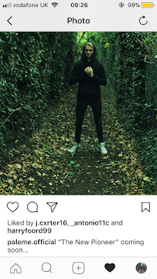
Instagram- Album announcement

Similar to our twitter announcement we have gave our followers a teaser of what is coming. This post includes the album cover and the name of the album so will create more of a hype than the twitter post as there is more to speculate about.


Twitter- Album announcement

Here we have announced that an album id coming soon on our twitter. By keeping this post simple with no date or detail we are building the hype as people retweet the post to there followers.

Website First Draft

Here is the original website design

As you can see it is rather basic, there is a mixture of lower and capital letters with the titles and this must be immediately changed so as to not deter the fans off the website. Currently our website editor is having troubles having the functions of the website actually working like the music being played on the LISTEN link. More tour dates could be added to that particular title, similarly we could include a wider variety of pictures in the gallery. Also, we are yet to add some merchandise to the website that has the Paleme logo on it, this is an essential component of a music artists website and thus must be added. Even the homepage could be improved and luckily we have produced this first draft to correct our errors and reach some sort of progression.


Website Research


This is the home page of the FLATBUSH ZOMBIE website, we can initially see the name of the group at the top of the page and underneath this are the various title links that will take the customer to the other pages that are available. The page then proceeds onto the their newest album that has been released and from this it can be ordered and purchased. Also they have given a preview of one of their songs that is included in this particular album name 'lava' with the official music video on top of that.


Next I clicked on the link title 'tunes' which brought out a selection bar on the right of the page, in this bar it contains all the other albums they have produced which can be clicked on to see the all the songs and videos that the album contains.


I have noticed that when you click on the different links an animation around that link appears, for example, when I clicked on tune there was a moving volume bar going up and down, with the merch animation there was a t-shirt that appeared, with the film there was an old fashioned film tape reeling upwards, and finally with the tour link a bus appears that is driving down a road. Anyway, back to the original point, where I was going to talk about when pressing the merchandise link and sidebar appears with a list of all the products that are available with their given price.


When I clicked on the film link it came up with every music video that they have published on YouTube. This is important as it allows the audience to watch these videos from the site, meaning that if a new customer or fan were to visit this website they would have an immediate insight into the music the artists produce and the general genre could me accumulated, from this they will be able to gain even more media attention.


Finally, when I clicked on the tour link it showed all the tour dates and where the tour is located. This is essential for it allows people to go and see the artist that they know and love, or even if they don't know the artist particularly well they still have the opportunity to go and see them live if they wish to do so.

Overall, I would say that although the Flatbush Zombies general genre is completely different to our own, we can gain a lot of influences from their website. It is quite funky and even trippy at times, with all the vibrant colors that the artists are always trying to portray, this is the same as Paleme. In my opinion this website needs some serious improvement because although thought the artists are not well-known world wide, they are very familiar in Europe, and have a high following from this, I would expect a better standard of website with some unique transitions or effects to make the consumer enticed into staying on the website. I have seen these artists live before at Wireless festival in Finsbury park and the persona that they represent is the same online as it is in real life, this makes them even more valued as they live up to their singing/rapping expectations.

Website Research 3


This is the home page of Travis Scott's website and in its centre is the eagle head, which is practically this artists brand image. It is 3D and rotates in a 360 degree circle in a consistent rotation. It seems basic but is actually very cool and relatable to those that already know the artist. It's nice to see something unique and advanced on a website compared to the other ones I have researched, the artist has gone a step further and invested in some really cool branding to promote himself. I have seen this artist live at a Brixton Gig and at the concert there was a huge eagle on stage with him, I believe this is constant throughout his performances, I think its nice to see such consistency as it creates a brand image, for which he can be recognisable. This is exceedingly important when entering the music industry, as his job will take him all around the world and thus he will need something like the eagle to stay in each of these countries for further promotion of his name and his music.


The top right link shows the recent and upcoming tour dates, locations and festival/gig name. In particularly liked the text font that they decided to use, and it correlated with the rest of the website as it perceives to be quite techy and this was the general direction for the entire website. Especially in todays modern age of advanced technology its a clever direction to choose and a lot of people will find this interesting. The key word there is 'interesting' because without it there is no ambition for a customer to stay on the website, otherwise they could potentially get bored.


This is the music link and to be honest I'm quite disappointed, its a very basic and boring page, for some reason there aren't enough album covers or anything like that; this could be a glitch, and it is vital it be fixed otherwise this could mean less people are purchasing this artists music. At times I was confused with this part of the website and it shouldn't cause this sort of misinterpretation to consumers as this segment of the website is so influential in increasing the artist fan base. The radio link is in line with what I stated above, the website needs some serious improvement considering he is such a well-known performer.


The video link is really good as the video instantly starts playing once you have clicked the link, this almost urges the audience to watch the video.

Overall, I would say that our website can receive a big amount of influence from this website, but we may struggle to find suitable and interesting transitions and effects, such as the ones Travis Scott has used, seeing as we don't have any money at all to invest in something so intricate as the 3D images etc. If we had the opportunity to include and apply similar effects and transitions it would be amazing, and very suitable to the aurora of Paleme. Although it could be said that this may not be in line with the synergy we have created that is based around 'nature and trippyness'.


Final Music Video