A2 advanced portfolio
Website Final
Here is the final outcome for the website, we decided to make the colour scheme changes, as we felt it improved the quality and feel for a professional website. We updated the social links so they functioned correctly and added them to the navigation bar so they can be easily accessed on every page.
We have included our color synergy of black and green, alongside using our imagery of our artist to represent his image, mood and genre. We have followed website conventions of including contact, social media and an overview/summary of our artist.
Question Four
Teacher Feedback
Positive Feedback (peer)
Critical Feedback (peer)
- Some shots are too similar.
- The lip-syncing is accurate and looks legitimate.
- Too many shots of our artist singing to the camera
- More shots required of the entire group “having fun”.
- Themes of nature and bucolic surroundings are portrayed well through the different choices of locations.
- A wider variety of transitions are needed to help the video’s flow. Straight cuts are used too much.
- Add more effects to enhance the video for the target audience.
- Many people liked the haystack location in particular as they saw it as unique.
- The music sounds distinctive therefore more effects are needed to accompany the music.
- The lighting in some shots needs to be improved.
- The dolly shot when the performer enters the cabin is very effective and well executed.
- The performer is in the majority of shots – does not feel totally like a music video ( more like a vlog).
Below is the final edit of the music video:
When gathering feedback on our final edit we carried out a mass viewing where we asked a group of sixth form students and also a group of year 10/11 students to sit and watch our music video. We felt this audience was suitable because it covered a large proportion of our actual target audience and included the types of people we anticipate would watch our film if it was officially released. Here are some images we captured during the mass viewing:


Unfortunately, we were not able to show our video on a larger & more visible screen because our final edit was having problems when we tried to export it and upload it to YouTube.
Before we started the viewing we ensured the audience had a questionnaire each to fill out during or after the video. When deciding on what questions we could include on the questionnaire we recognized that a mixture of open and closed questions could be useful for us to analyse. We also had to consider that the audience was made up of non-media students and lower school pupils. This implied that they knew very little about Paleme's new music video and may have been the first time they had even heard of the artist. Consequently, we resolved to very simple questions such as "What did you like about the video?" & "Would you consider buying Paleme's new single: Drugs?". Our aim from this feedback was to get a general consensus of what our target audience thought when watching the video for the first time.


Here are two completed questionnaires that we received.
I used charts to visually summarise the answers we found from the eleven members who filled the short questionnaire.
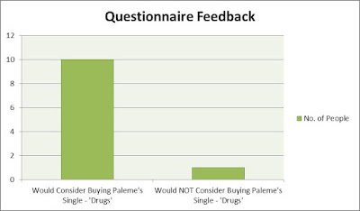
This result is very pleasing for use because it implies that our audience enjoyed the first look of the music video. We can then infer that this group is very similar to our target audience suggesting that there is a high chance they will admire enjoy Paleme and his new single 'Drugs'.
Head-Shot Interview
The simplicity of the questionnaire was very useful for us when acquiring feedback from a large group of people and in a small amount of time. However, we lacked in-depth feedback and the best way for us to get this was to interview one person and ask them open questions after watching the video multiple times. Below is the interview we carried out with a fellow sixth former who, in particular, enjoys watching music videos on YouTube made by some of the biggest artists in the world. From this interview, we could identify the level of professionalism that went into our final piece. It is important that these views came from an external source who had not already found out about Paleme because the feedback is more genuine and less biased.
From this interview we were able to gain some useful qualitative feedback. Below is a table of the feedback we received:
Question:
|
Answer:
|
How is this answer useful?
|
After watching the video, what themes could you identify?
|
The stand out theme is mother nature and the environment.
|
This was very positive to hear because our synergy across each ancillary text is nature and it features heavily in both the digipack and the video. We aimed to utilise this theme by having Paleme stand in front of naturistic scenery both in the video and in the photoshoot.
|
Do you think the performance of Paleme is suitable for the genre of alternative rock?
|
It’s unique, Paleme wants to express his individuality and therefore chooses not to conform to the conventions.
|
Paleme’s genre is alternative rock yet with a modern twist. This makes is sound almost like pop music but is still categorised in alternative rock. This makes Paleme different to any other artist from this genre so it was very pleasing to hear that the interviewee recognised that Paleme is driven on creating his own unique brand image.
|
Do you think there is a wide enough variety of camera angles/shots?
|
Yes, there are high/low angle shots, tracking shots and panning movements.
|
We made sure we included a variety of shots because we really wanted to emphasise the connection between Paleme and mother nature. In particular, the panning movement towards the end the video features a close up of Paleme with the camera performing a 360-degree movement around him. In this shot, all that can be seen around Paleme is the beautiful green effect from the surrounding bushes and trees.
|
What is your favourite aspect of the video?
|
I particularly like the scenes where the group are having fun on the hay bales as it shows the rebellious natures of youths.
|
This location was our personal favourite because it was difficult to acquire as it was so high up. We feel we created good quality pieces of footage at this location because it shows Paleme in his element with his crew. To hear that this part was admired by the interviewee is satisfying because it makes all the hassle of getting so high up worth it.
|
What do you think could be improved about our video?
|
More inclusion of the back-up members as they are seen in some scenes but not the majority of them.
|
It is important to hear some critical feedback so this is why I asked “what you think could be improved?”. The interviewee pointed out that the entire video could have taken a different structure in order to include more shots of Paleme’s supporting group. Before making the video we were stuck between what sort of narrative the video would entail. We could not choose between a love story or a fun/happy story with his best friends. Consequently, we included both these narratives which caused some confusion for the audience. Looking back, if we were given more time we would have chosen one narrative to match the music and ensure we had enough footage to portray this story well so the viewers know fully well what it is about.
|
Digipack Feedback
Website Feedback
Below is the first draft of the website:
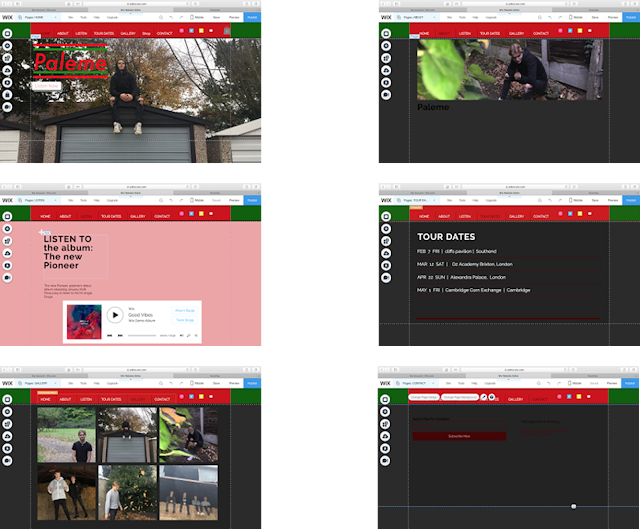
After the first draft of the website was published, we placed both the website and digipack on a Survey Monkey and asked our peers to give us feedback online. Below is a table including both positive and negative feedback for the first draft of our website.
Positive Feedback:
- Good use of colour contributing to the brand synergy.
- Transitions between pages are good.
- Navigation around the website is easy to follow.
- The home page background image is very effective and represents Paleme’s individuality.
- The oversized logo on the home page helps to give Paleme a better image overall.
- The “listen” page is useful because Paleme’s new hit single can be played by the audience.
Negative Feedback:
- Not all the social media links work.
- On the gallery page, the bottom left picture is blurry.
- The “about” page needs a lot more information for the audience to read.
- The “contact” page needs more features to allow the audience various way of contacting us.
- The “Listen” page has a colour theme which does not match the rest of the website.
Final draft of our website:
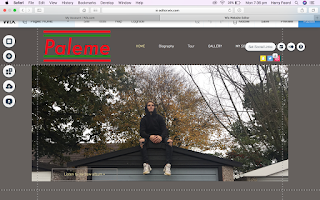
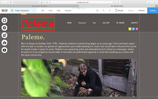
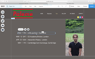
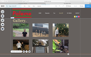
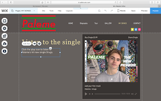
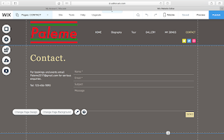
Clearly we made some significant changes to our website after receiving feedback. Many people said that our "about" page needed additions. From this we changed the tab so it is now called "Biography" and we put in a paragraph of text which gives an insight to Paleme's first introduction to music at a young age. In our first draft, the audience could only subscribe to Paleme for updates. However, in our final website the viewers are now able to input some their name and type a personal message to Paleme. We made some changes to the "Listen"page from the first draft. Again, we renamed the bar to "My Songs" and when this page is opened there is Paleme's new CD cover as a thumbnail for the song being played.
Focus Group:
In order to gain some more qualitative feedback, we put together a small focus group who looked at Paleme's final website & digipack. The people who took part in the focus group were unaware of who Paleme is and what he does. After explaining that Paleme is a new upcoming artist we showed the focus group the two main ancillary texts (website & digipack).


Here is what the focus group members said after the viewing was complete:
"For me, the CD cover (digipack) looks original and I really love the variety of images across the six part layout. It is clear that the creator of this has maintained one theme throughout the CD, this is obvious because all the images contain environmental settings showing that this is the theme they chose and stuck to."
"The website is very well produced - it is simplistic but this makes it easy for me to navigate myself around the website. In particular, I love the feature on the section called "My Song" where i can play the song with the CD front cover set as the thumbnail. This makes it look professional just like when I would go and use Apple Music because the album cover image pops up identical to how it looks on the website."
"I feel like there is not enough information based on 'Paleme' and his youthful days. Although there is a short paragraph, I feel the creator of the website could have improved by adding some more information"
"If you could improve the digipack any further, all i would say is too maybe sharpen the images because one or two - especially the bottom left one is blurred compared with the others. Additionally, i like the effects used because the top right picture looks distorted yet it gives it a distinctive feel. It is my favorite image because it captures the two most important things: Paleme and nature."
Summary of all feedback:
The audience feedback we received over the course of this journey proved to be very essential. We changed parts in our video which our teacher & peers thought could be improved. For example, a common thought after our first draft of the video was that it lacked effects which had they been included our video would certainly be of a better standard. As a result, we ensured that our final music video contained different enhancing effects such as the colour changing effect and the duplication effect. Not only did we consider our critical feedback but we also made sure we acknowledged what people liked in our different ancillary texts. The digipack first draft was very well received and people loved the choices of images. For this reason we continued using the pictures that were liked and only changed the ones that were not liked so much. We created a final digipack which had changes that our audience felt were needed but much of it was very similar to the first draft in terms on the content on it. Even after our final drafts were published we still wanted to gain audience feedback to look at what we could have improved if we had more time.
Evaluation Question One Plan
Here is the plan I have created for my evaluation Q1. This plan will act as a guidance as i produce my voice over answer, the imagery is the examples of our research and our products we have produced.
Music Video First Draft
Mrs Brookes thought that some of our shots were too similar, thus she recommended that we applu more variation to our music video. Similarly, Mrs thought that we needed to include more group shots of the guys 'having fun' as a majority of the shots are just of our main performer Paleme(Jordan) singing to the camera. Although this draft hasn't got any after effects on it yet, because our group is planning to make it colourful and visually more 'trippy'. I will now attempt to change the video in accordance with our teachers advice, so as to get the produce the best possible music video and receive a grade appropriate to this.
Music Video Second Draft
The changes that have been made to the first draft are seen here, we have improved the our video based upon the advice and feedback that has been given to us. This included adding more shots of the girl named Robyn whom wasn't in the video enough beforehand, I have attempted to correct the lip syncing and have also taken out a few of the shots that were considered to be of a bad quality.
Teacher feedback
0:19 contrast
0:21 contrast
0:37 lips
0:50-51 shots do not match
0:53 remove green from the hay
0:21 contrast
0:37 lips
0:50-51 shots do not match
0:53 remove green from the hay
Too many alley way shots
remove car park scenes
too samey :2:30
remove car park scenes
too samey :2:30
I will change these things that my teacher has mentioned, as they all play a role in making the video more coherent and consistent with a narrative that makes sense. It also improves the overall elegance of our music video.
First Draft Feedback
Our first feedback received a reoccurring level of feedback. The majority of our feedback included the video including too many shots of our artist singing, too many similar shots (framing and angle), no effects (incomplete) and finally too little transitions. Therefore to improve this we will firstly need to rearrange the order of shots and complete the length of our video before applying after effects to exaggerate our image and to create a stronger link between imagery and the lyrics/sound. This could be achieved through finding new and interesting effects to give the video more coherency, because otherwise the audience will gradually get bored with the similar and repetitive singing shots that will lower our overall marks. Another potentiality would be to get some more filming done, so that we can accordingly fit in the correct footage that suits our video best.
On location 1

Here is us getting involved in the acting of the filming on location 1. This was a great chance for us to get some active filming between the singing.

This is a photo before we started filming as we gained location a group photos for our social media accounts and website, This way we could interact with our followers during filming.

During our time at location 1 there was many chances for us to experiment with high and low angles during filming as a group.

Finally this is a shot during the performance of our main performer at location 1.
On Location 2

This is a shot from our group on location 2 helping each other up to the filming point, this allowed us again to gain more angles during filming and therefore benefit the shots we took from location 2.

Again on location 2 you can see the process of getting to the film location and gaining the shots.
Location Shooting
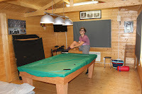
This is the Cabin in Sam's garden, it isn't particularly big but provides a retro vibe, and its a perfect shot from this angle. It's sports themed which isn't in correlation with our synergy but still I think this location is appropriate for our video.


This is the garden when looking from the position of the cabin, personally I don't find it to be very interesting and that is why I advised not to film any shots in this particular area/angle.


This is Shellow road, which is long and full of huge trees down either side of the road, its a typical country road so isn't perfectly straight and smooth.


This is the same road just a bit further down, you can perceive that it slowly becomes more forested and full of nature, this place is completely suitable for our filming and the justification of this is the beauty of this location.


This is an open field location which can be astounding to look at on a sunny day, although shooting here will disable any background views; as there is little to see.


This is the road leading down to the local farm, it has many apple trees and various other plantations.
Teacher Review- prior to first draft
Mrs Brookes thought that some of our shots were too similar, thus she recommended that we apply more variation to our music video. Similarly, she thought that we needed to include more group shots of the guys 'having fun' as a majority of the shots are just of our main performer Paleme (Jordan) singing to the camera. Although this draft hasn't got any after effects on it yet, because our group is planning to make it colourful and visually more vibrant. I will now attempt to change the video in accordance with our teachers advice, so as to get the produce the best possible music video and receive a grade appropriate to this.
Photoshoot
Here are a few sample photos from our main artist photoshoot, these photos in these locations will be used as part of our digipack, website and magazine cover.
Subscribe to:
Comments (Atom)


